Role:
Lead Product Designer
Team:
Product Manager
Product Designers x2
Developers x2
Process:
Scrum (Sprints), Notion
TL;DR:
Built a scalable design system to support product growth
Standardized UI patterns across the product
Reduced design-to-development friction
Introduced AI-assisted workflows (Codex, Vibe Code)
Implemented Storybook as a shared source of truth
This work builds on the product redesign, focusing on scalability, consistency, and system adoption.

Understanding the product
TAP Mindset is a digital coaching platform designed to help athletes build mental resilience through structured routines, guided exercises and reflection.
As the product evolved, new features were introduced to support different moments of the training journey. Over time, the interface started to grow in complexity and consistency became harder to maintain.
Before defining a system, it was essential to understand how the product was being used and where structure was missing.

The system began by defining the foundations of the interface.
Color, typography and spacing were structured as system variables instead of individual design decisions. This created a consistent visual language across the product.
Accessibility was integrated from the start. Color contrast, typography scale and interaction states were defined to ensure readability and predictable behaviour across different contexts.

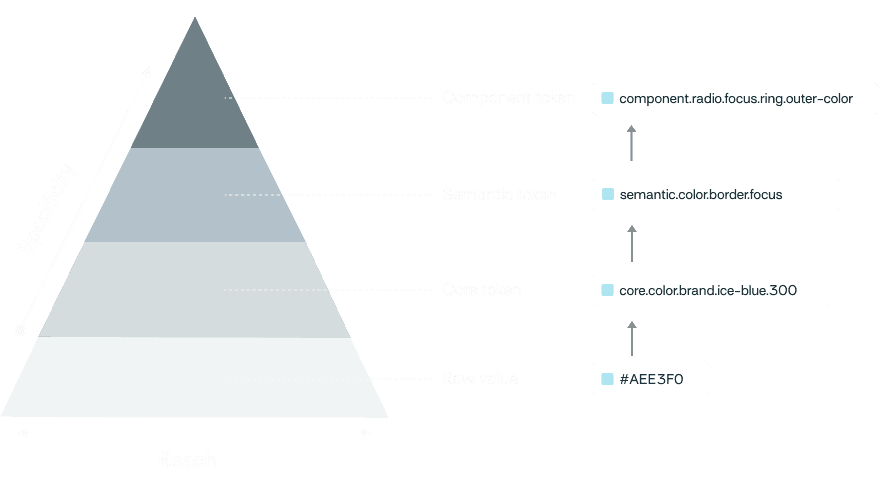
Design Tokens
Component Architecture
With the foundations in place, reusable components were introduced to structure the interface.
Components were designed as modular building blocks, with clear variants and interaction states.
Instead of designing screens independently, the interface could be assembled using consistent patterns, allowing the product to evolve without introducing new inconsistencies.

Design to code Workflow
The design system was connected to a structured design-to-code workflow.
Documentation was created in Figma using Figma Make and Specs, allowing component behaviour and guidelines to live alongside the design library.
A GitHub repository was used to manage token architecture. Using Visual Studio with Codex integration, tokens were implemented and maintained in code.
Component documentation was generated through the Figma MCP server, and the component library was published in Storybook, with Chromatic enabling version control and visual testing.
This workflow connected design, documentation and development into a single pipeline.

Outcome
The design system created a scalable foundation for the TAP Mindset interface.
It improved consistency across the product, reduced duplicated design decisions and enabled a clearer workflow between design and development.
The system now supports the evolution of the product by providing a shared structure for both interface and implementation.
fewer UI inconsistencies
faster creation of new screens
faster design-to-development workflow

Conclussions and future steps
This project established a structured foundation for the TAP Mindset interface.
By introducing a design system, the product moved from a collection of independent screens to a consistent and scalable interface. It improved clarity, reduced duplication and enabled a more efficient collaboration between design and development.
Looking ahead, the system will continue to evolve alongside the product. Future work includes expanding the component library, refining accessibility standards and strengthening the integration between design and development workflows.
The system is not a finished artifact, but a living layer that supports how the product grows over time.